Multi-Theme Hoarding System Aeon Mall Ha Dong
Client | Aeon Mall Hà Đông
Design | Look Concept
Production | Look Concept
Concept & Inspiration
The challenge was designing a space flexible enough for two very different modes: daytime workshop activities and weekend off-fan events drawing tens of thousands of visitors. Look's approach was a scheduling-adaptive design system. The "Pop" mascot was positioned at key sightlines to guide visitors from the stage area to check-in clusters. Arirang red served as the spatial connective tissue, delivering the high-energy feel of the BTS fan universe while staying compatible with AEON Mall's everyday retail rhythm. Every decision was grounded in operational reality, keeping the space functional for both workshop crews and event crowds.
Real-life Photos
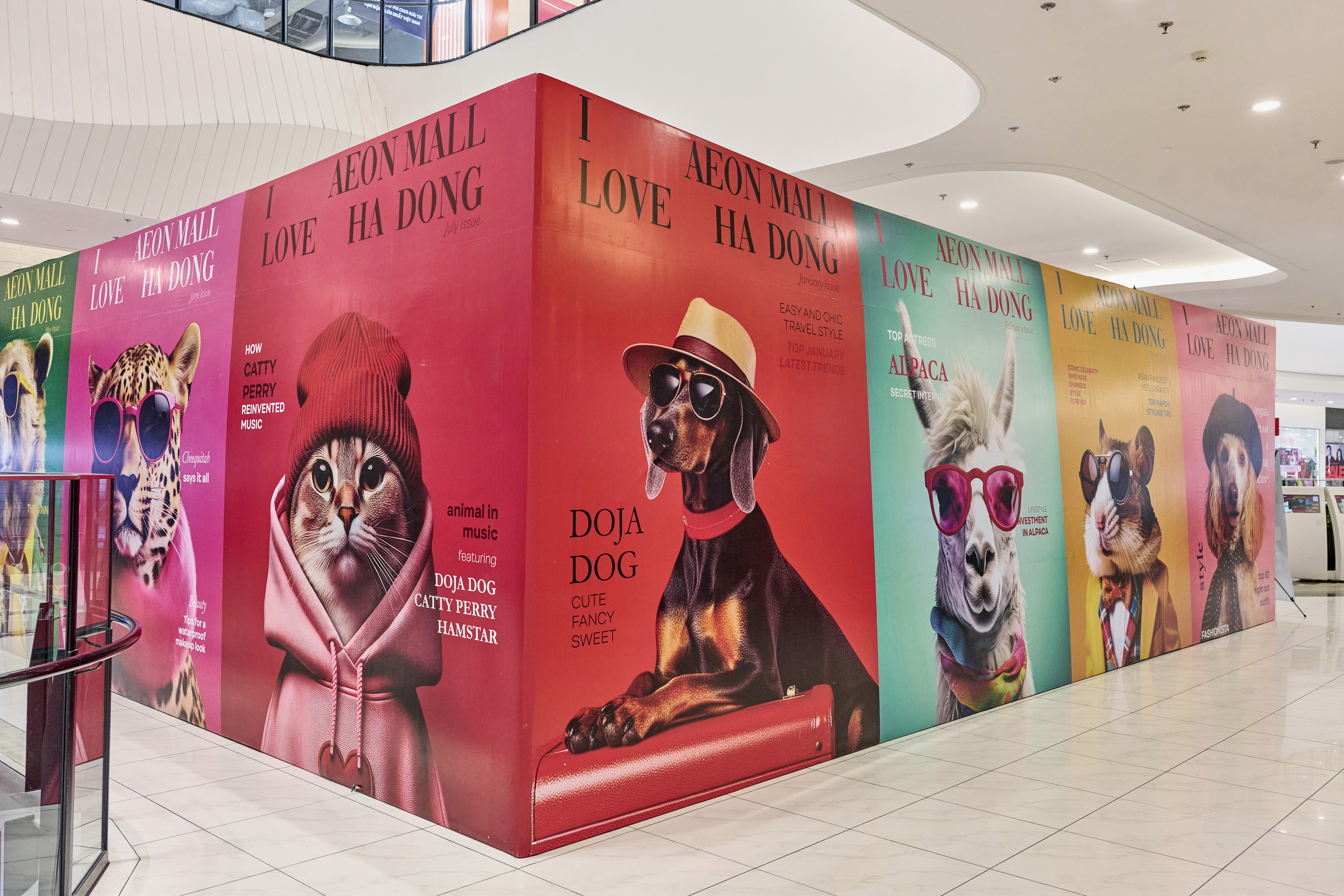
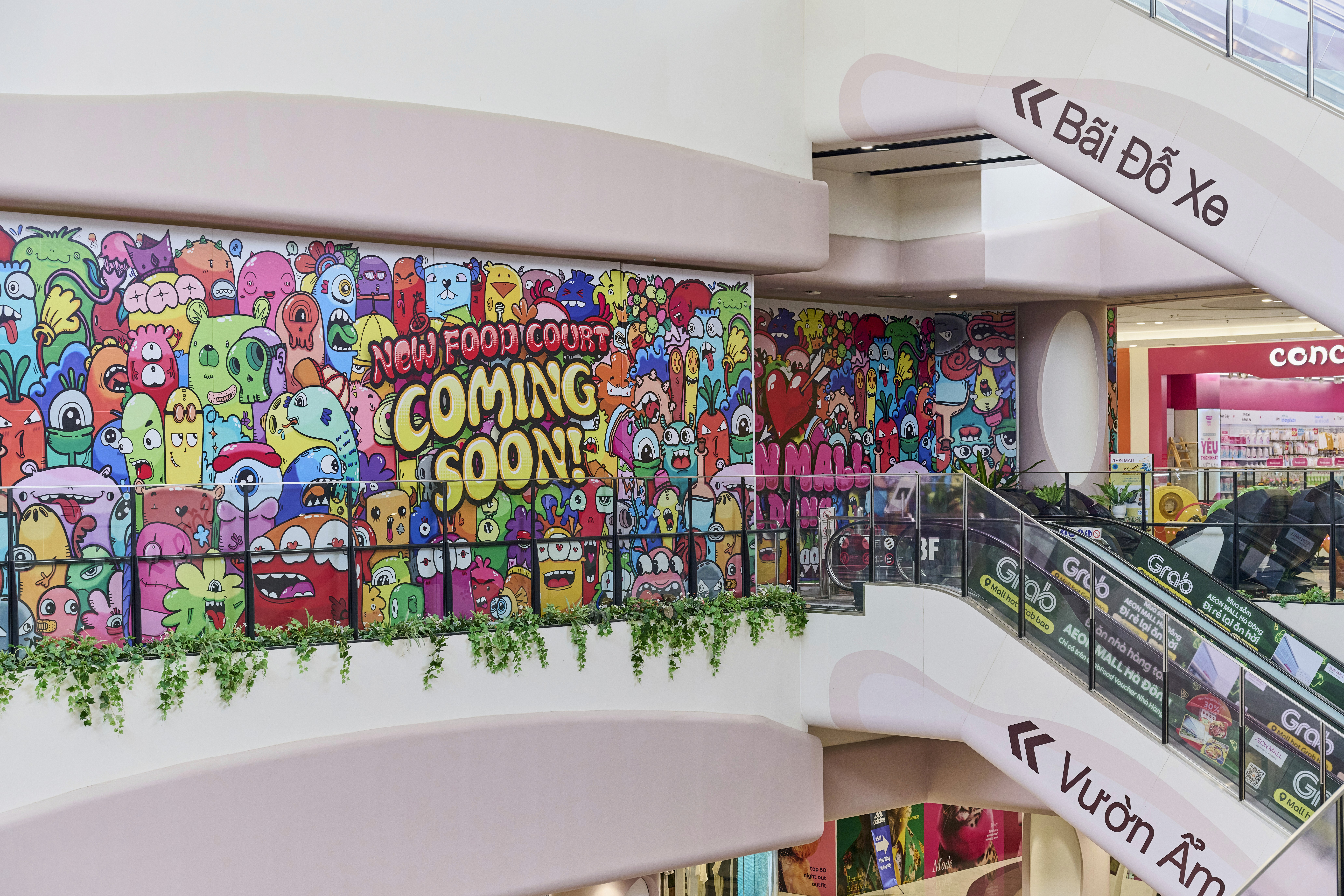
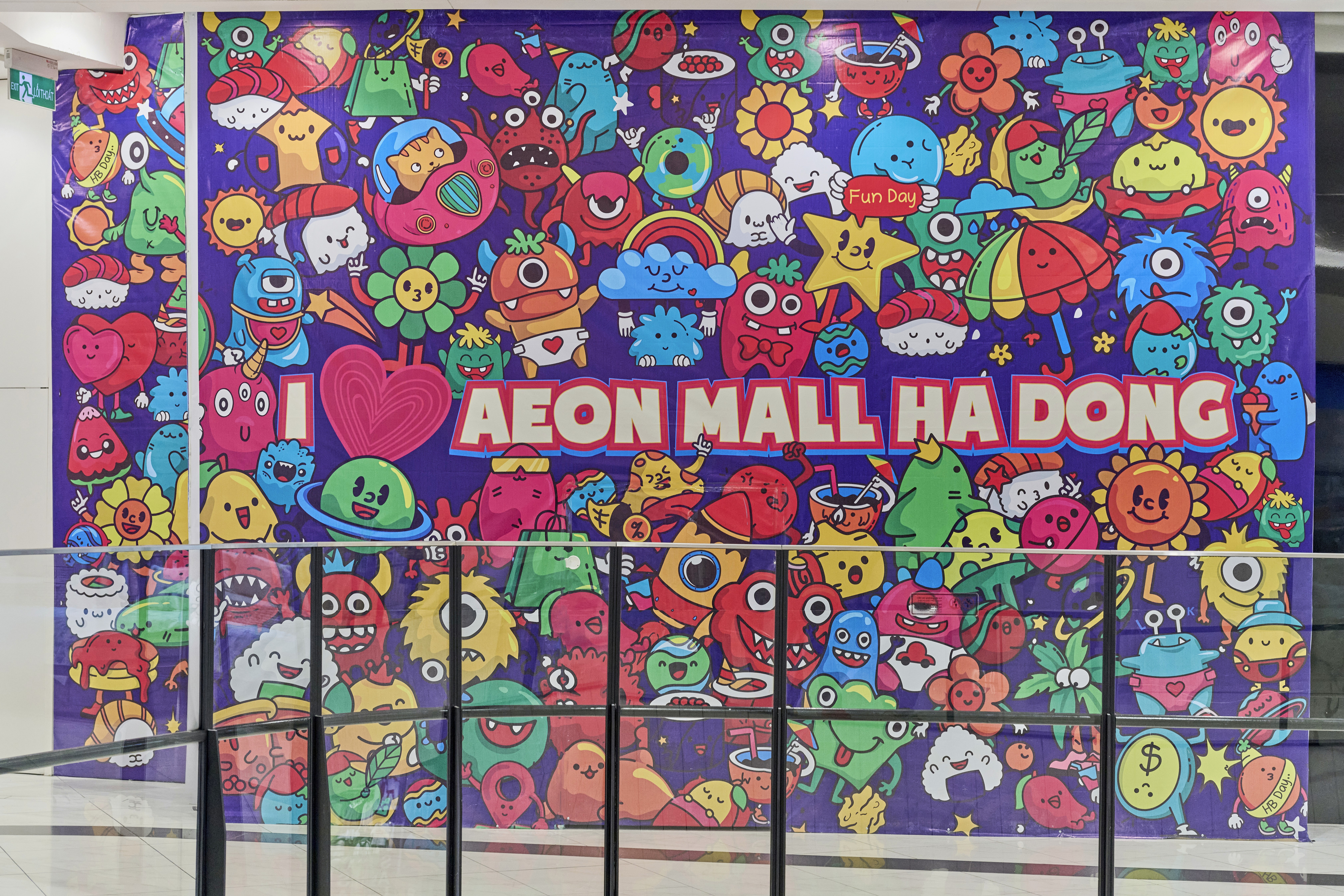
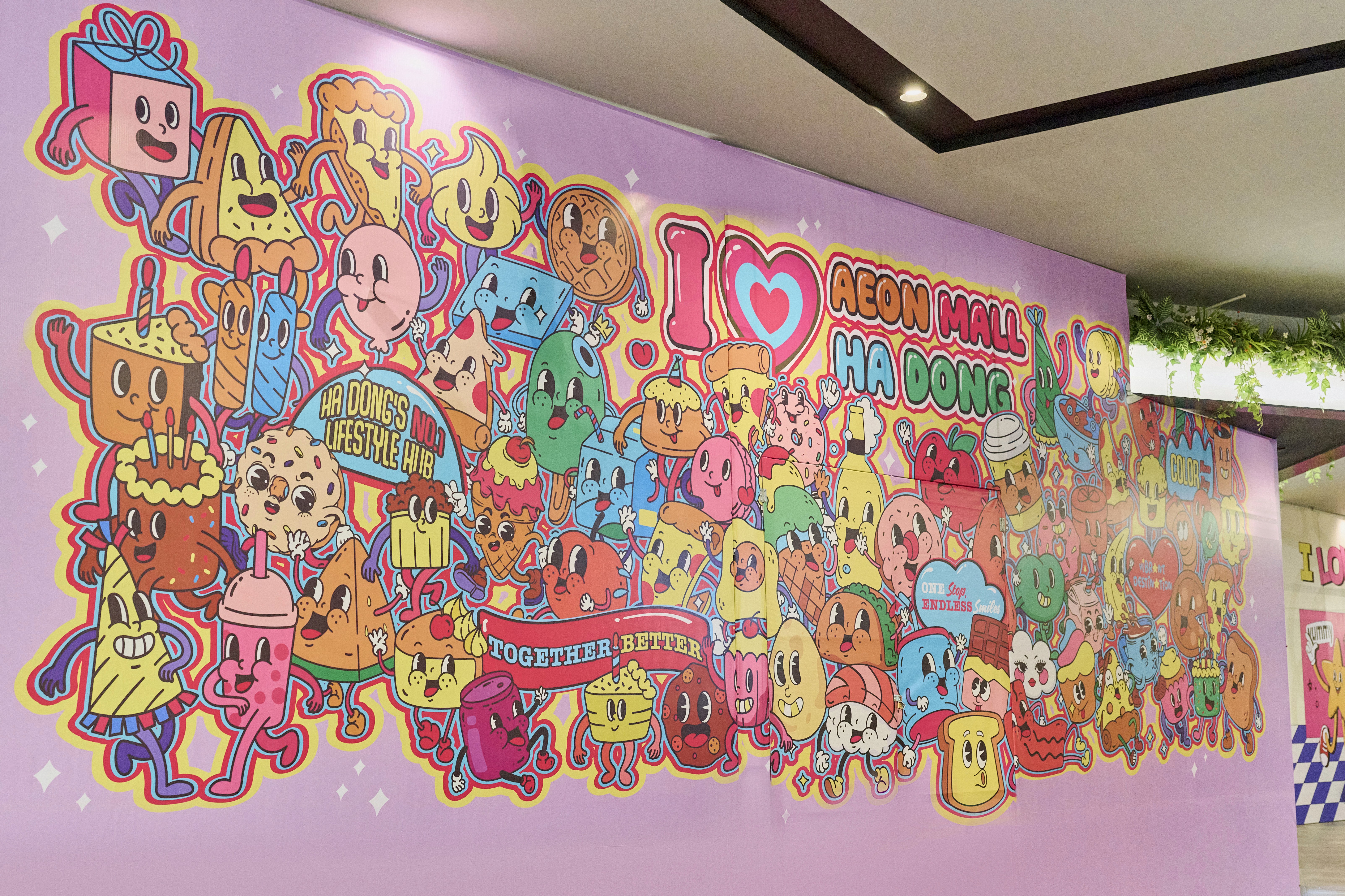
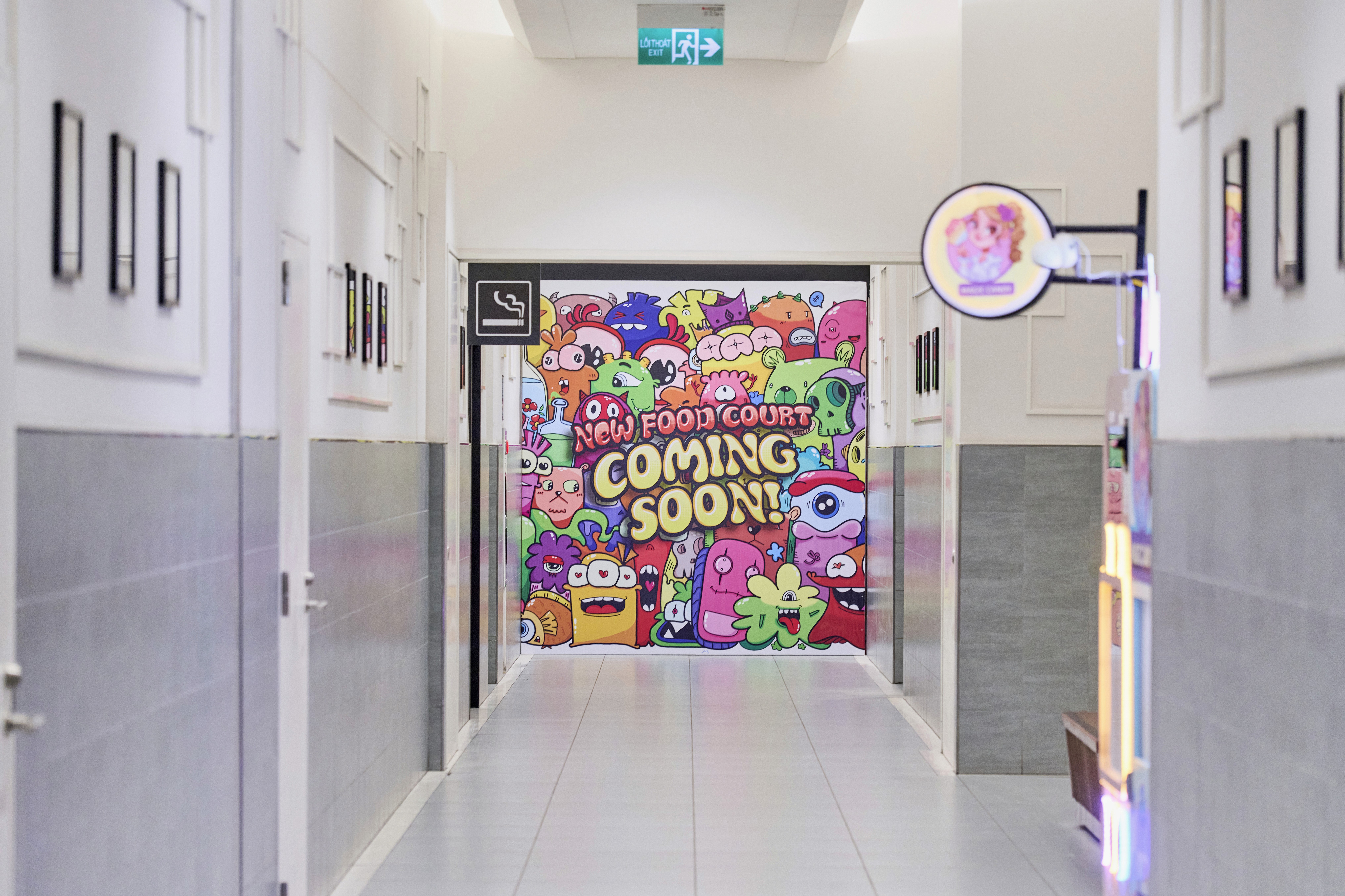
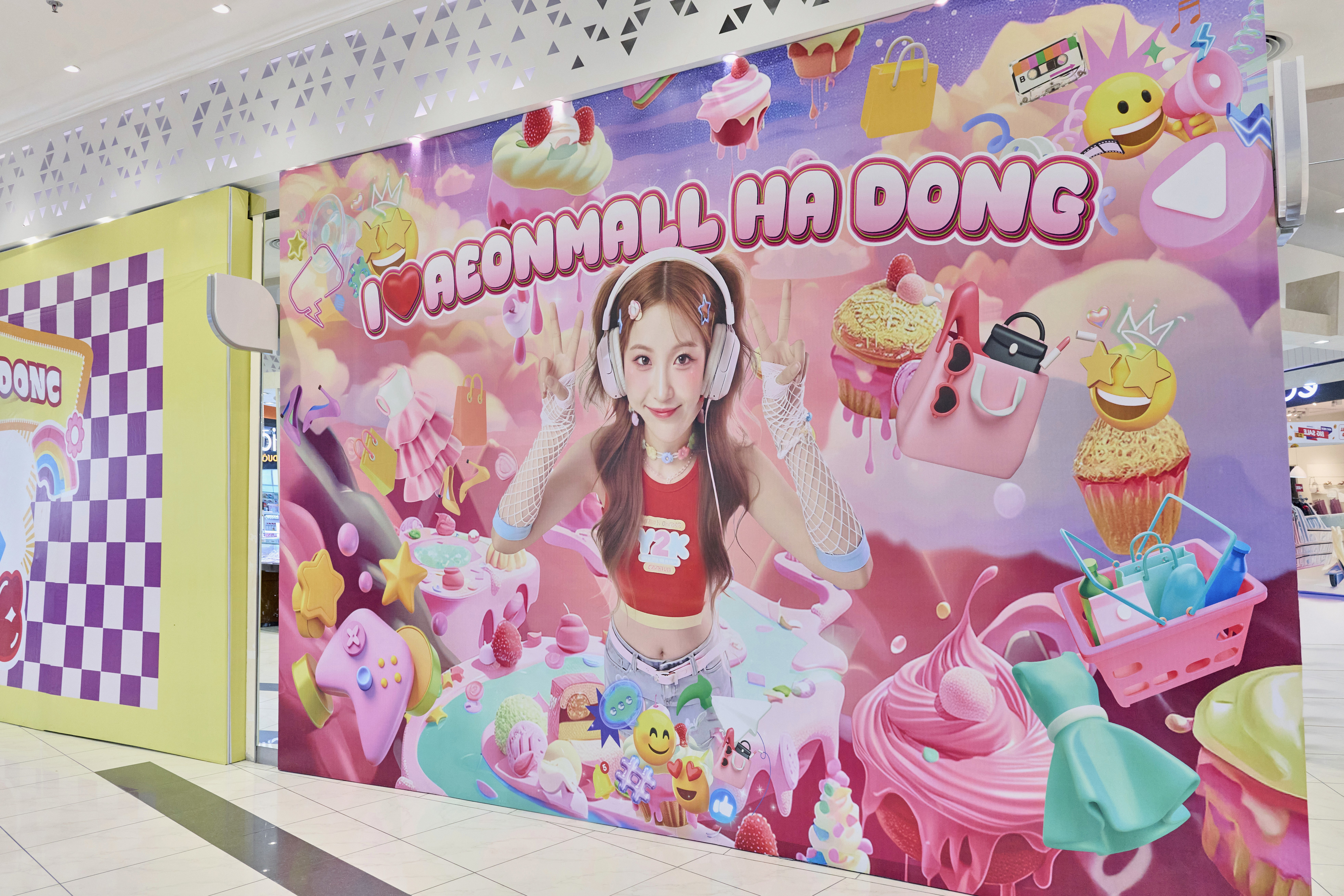
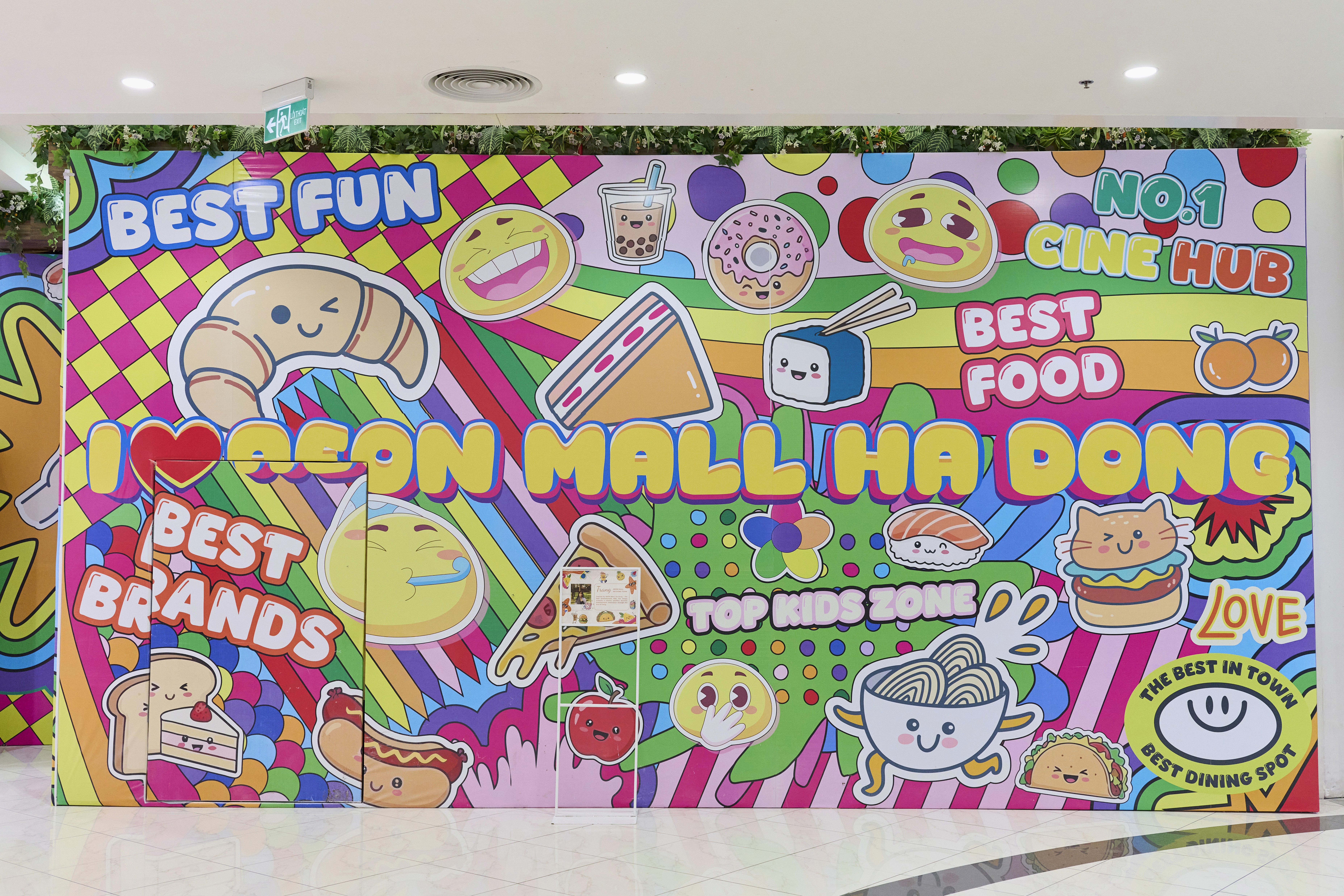
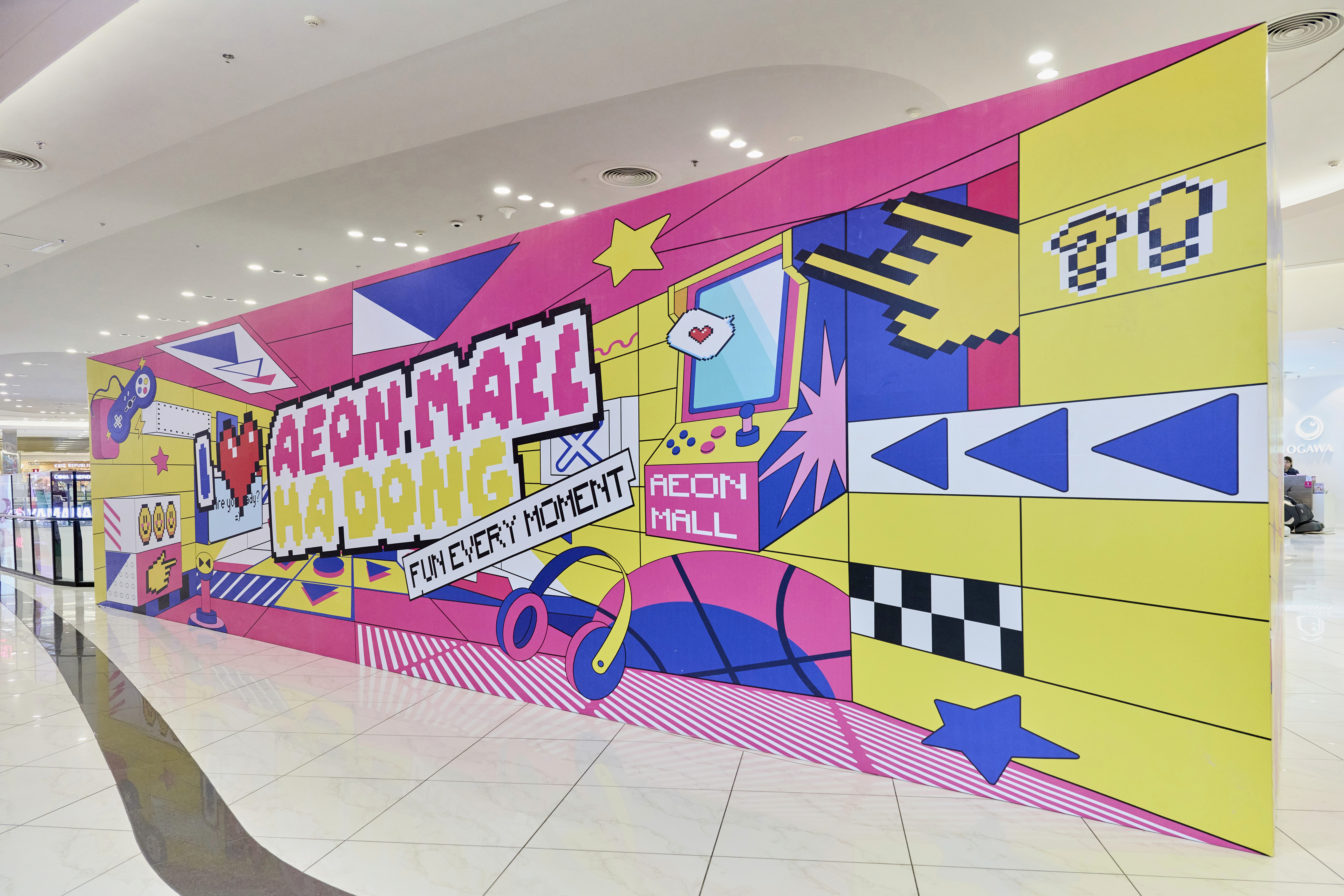
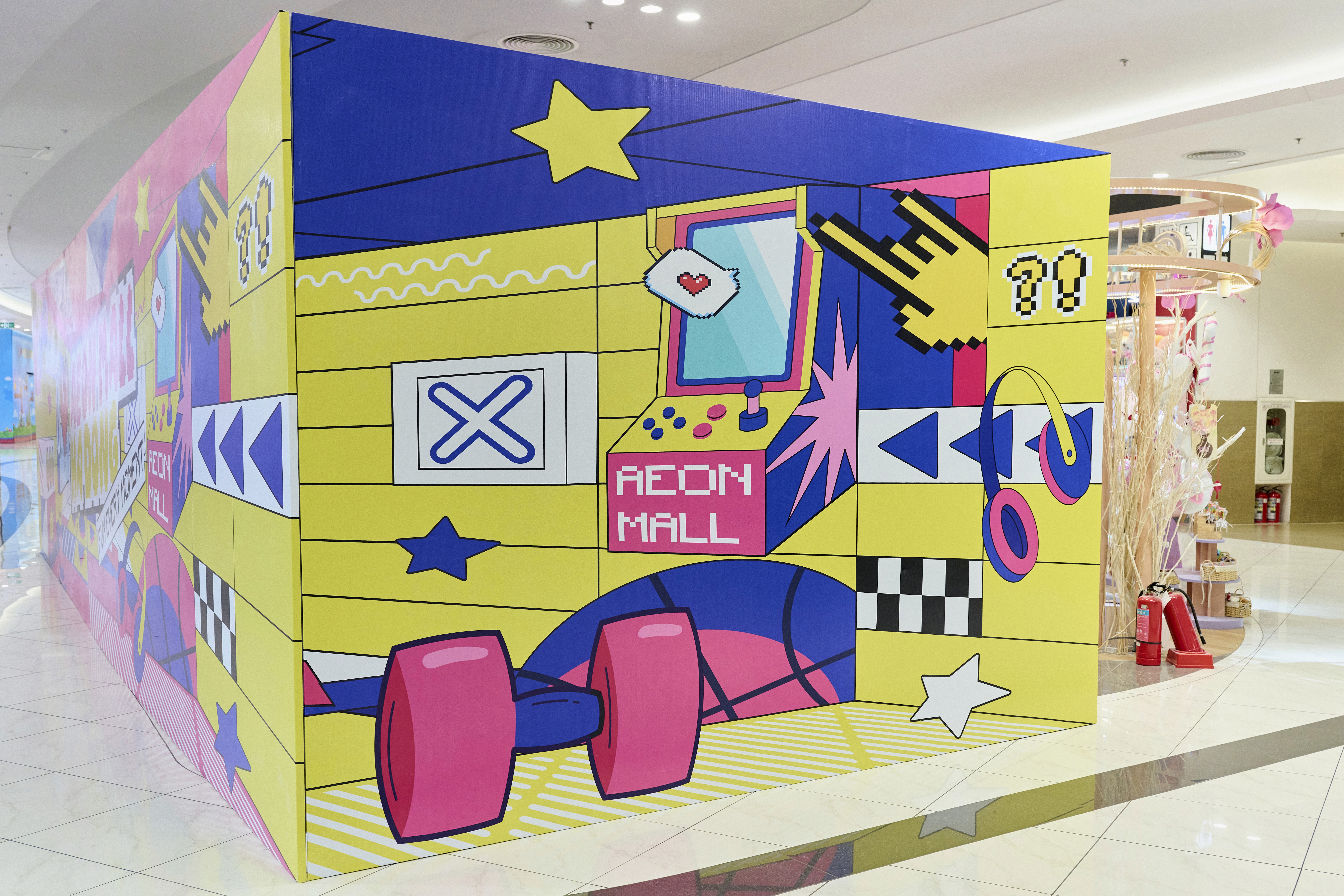
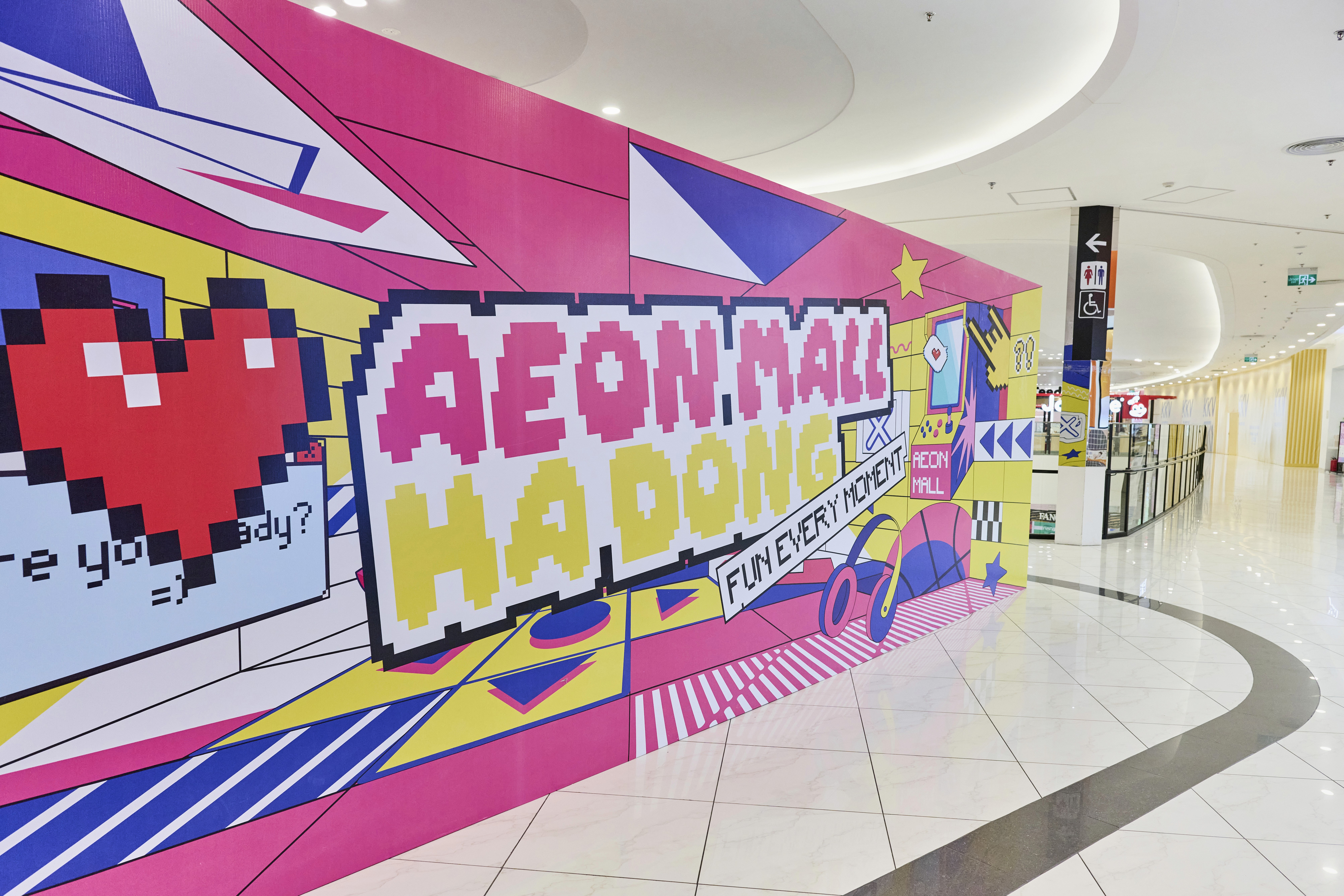
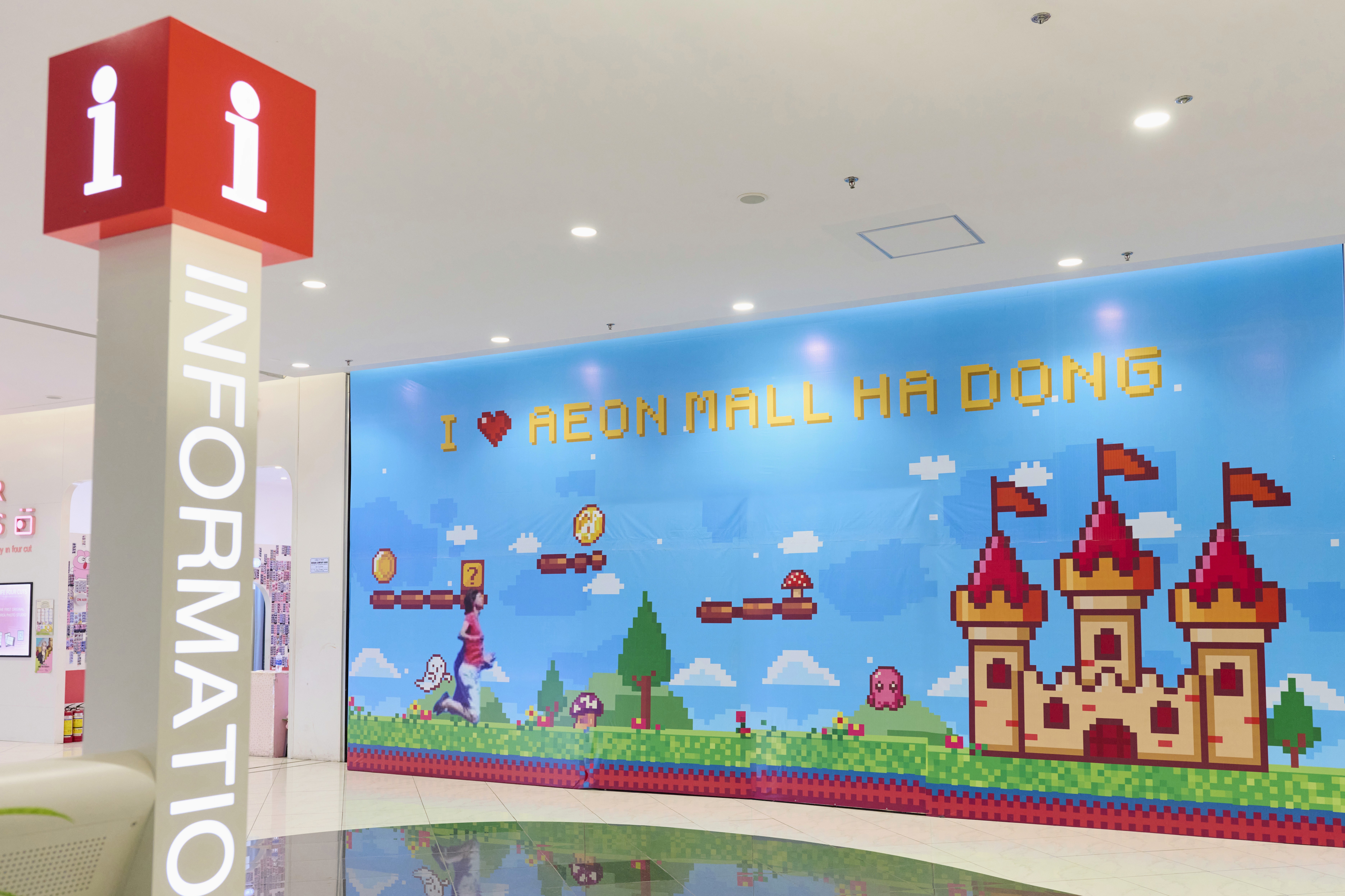
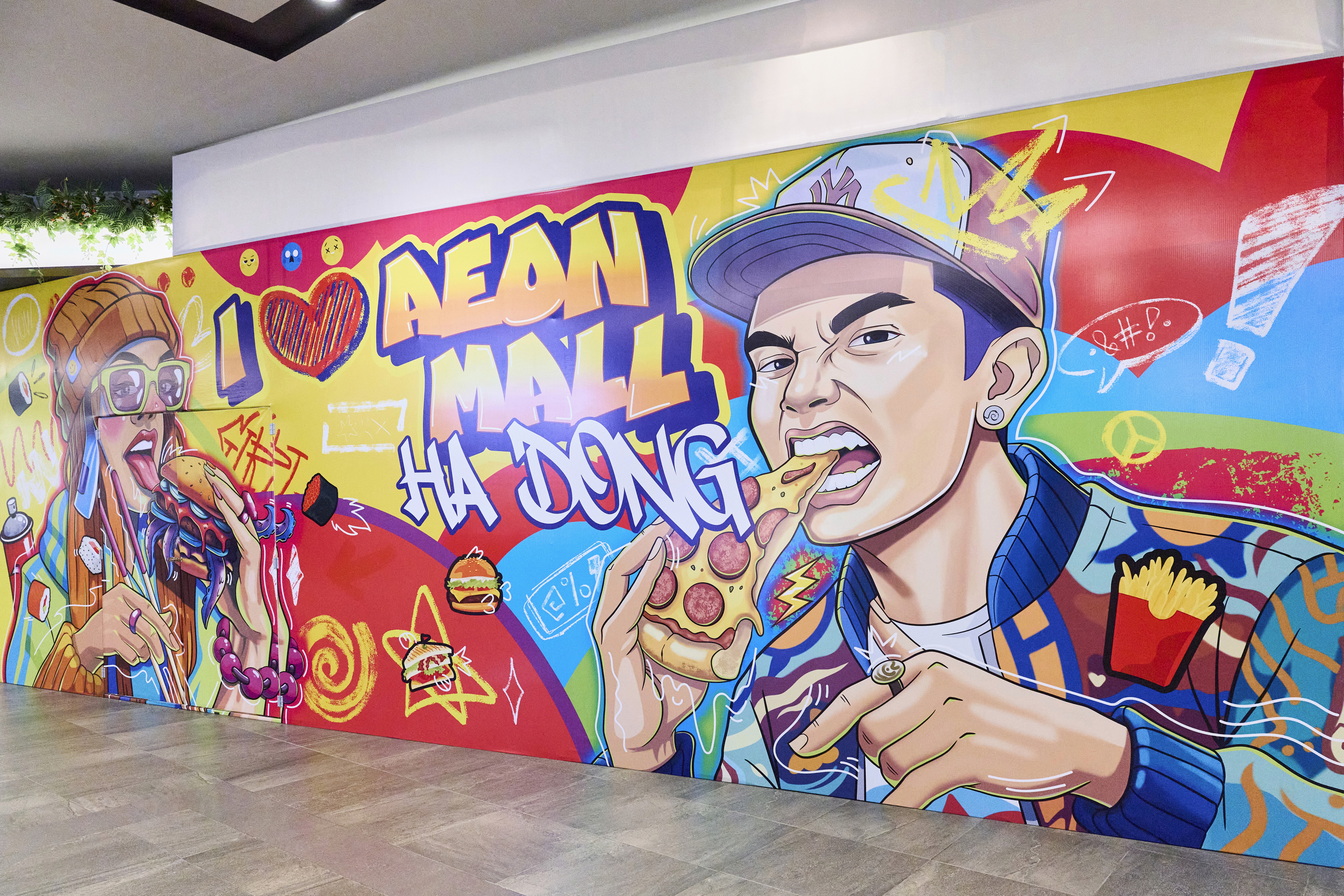
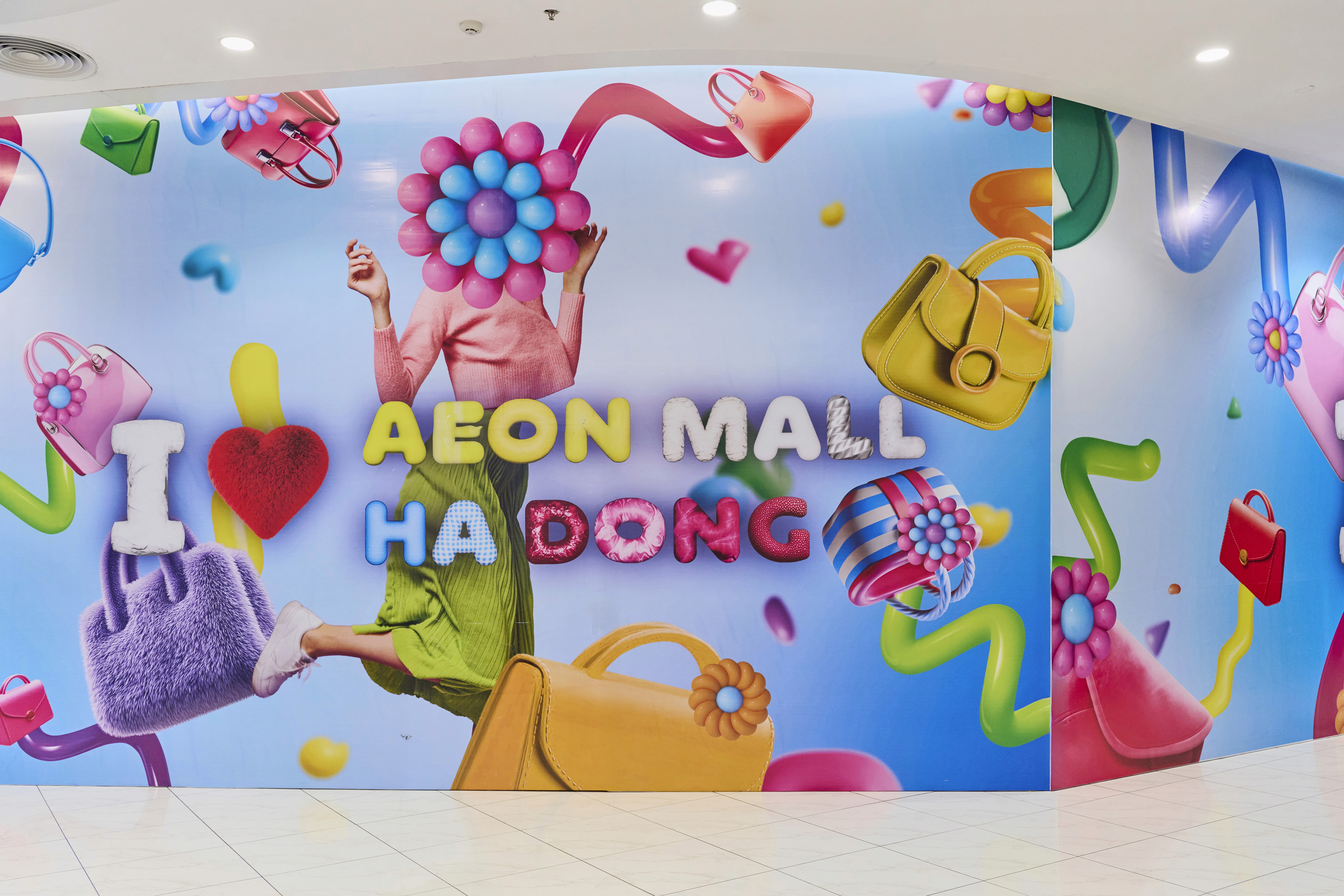
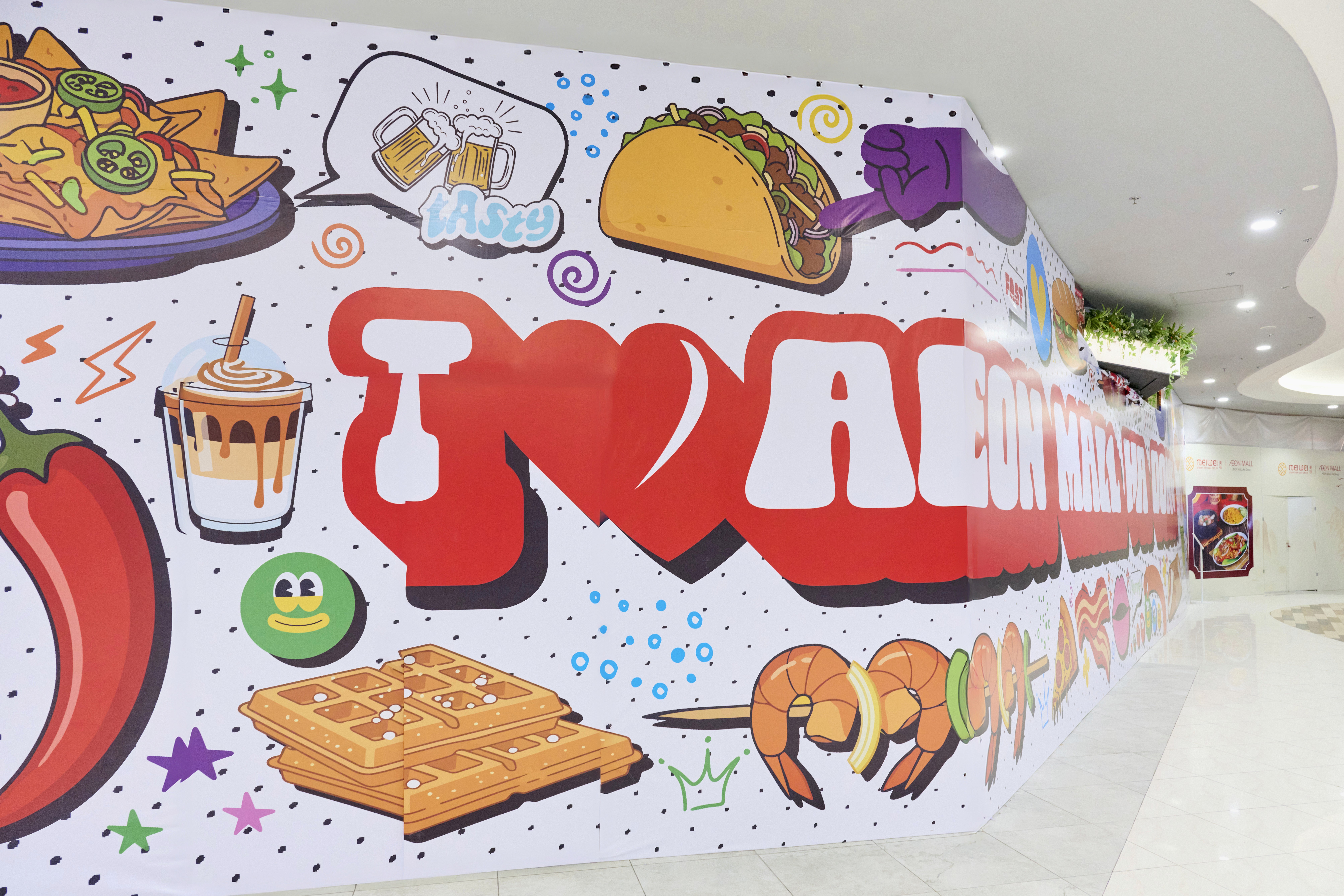
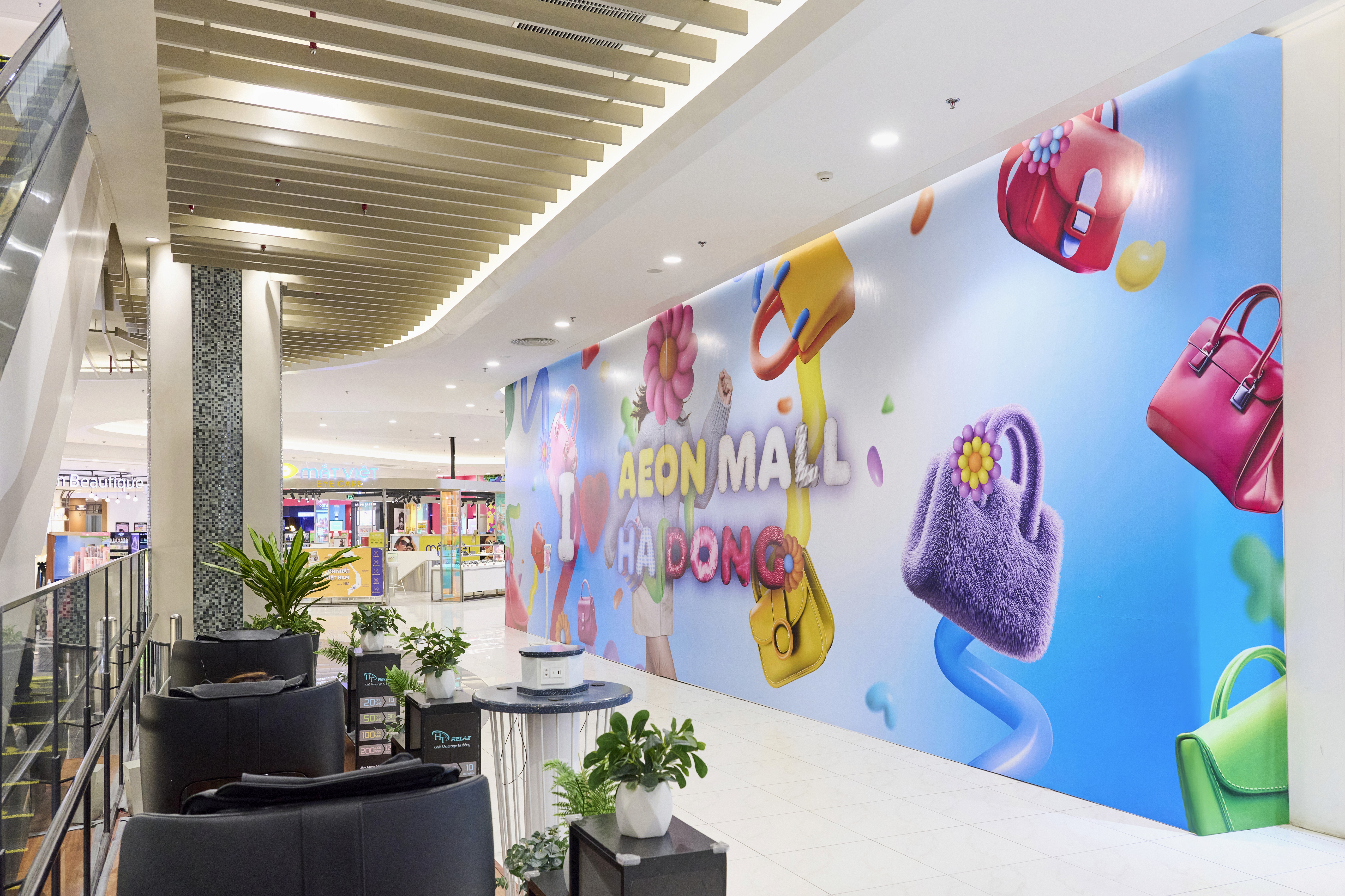
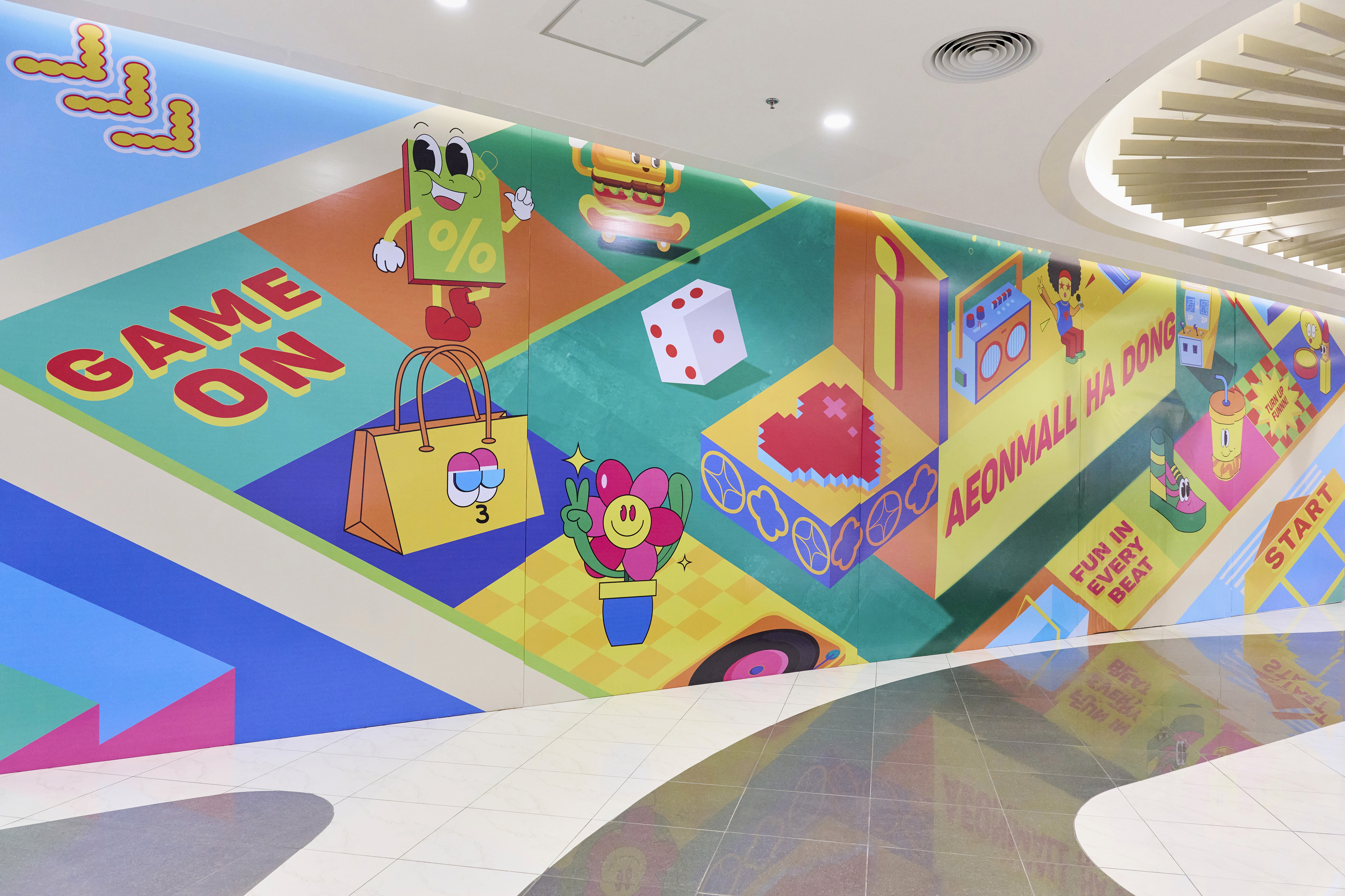
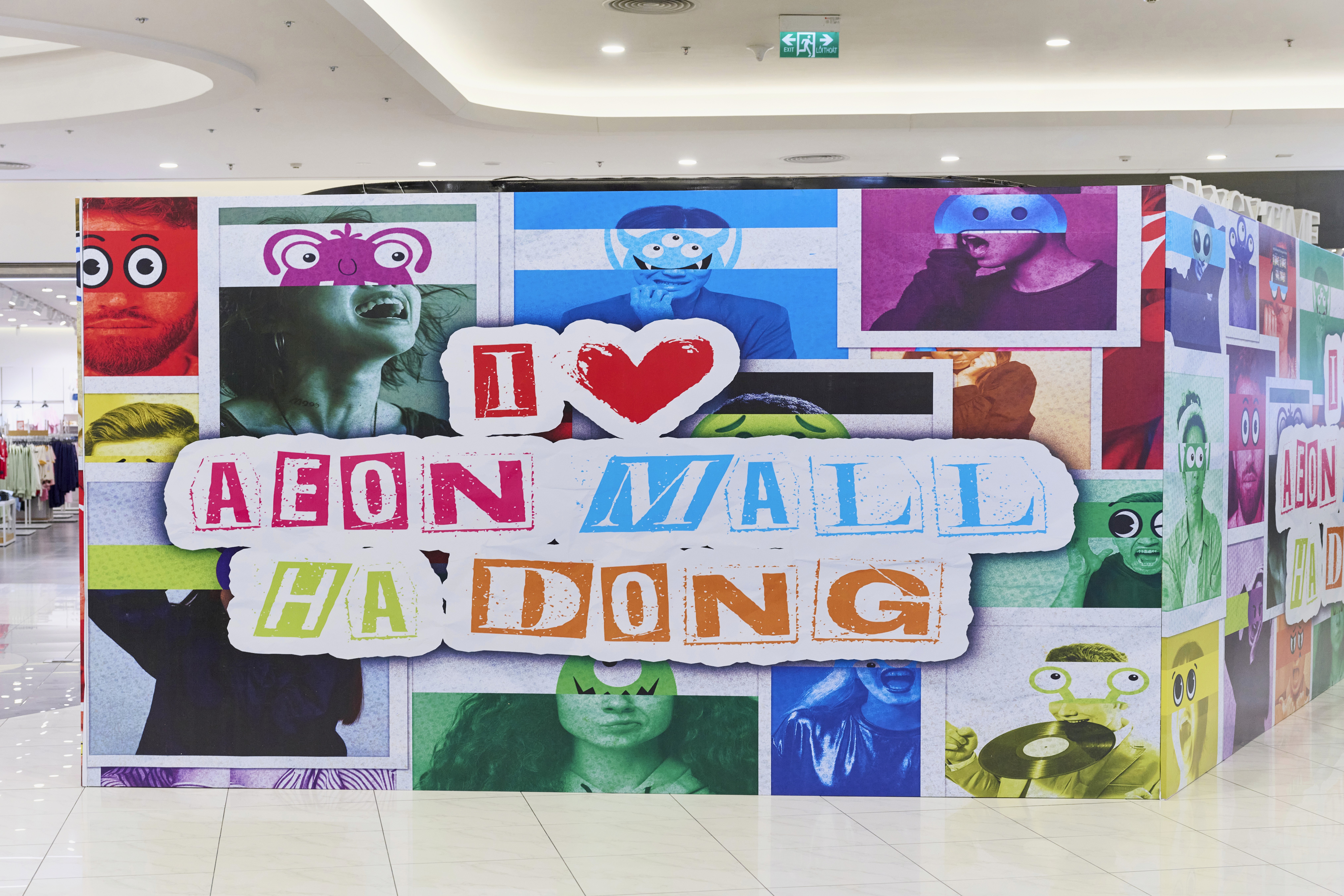
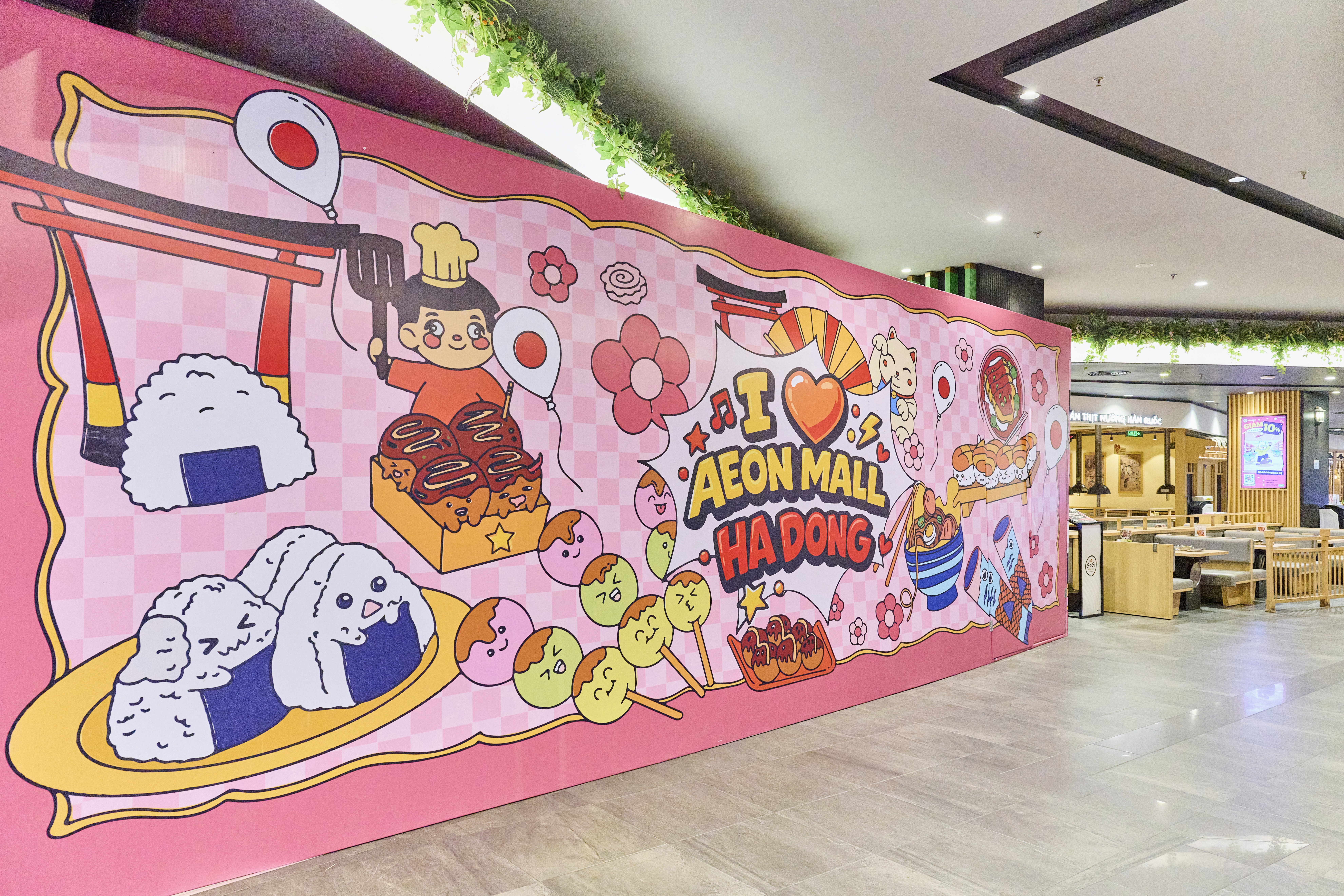
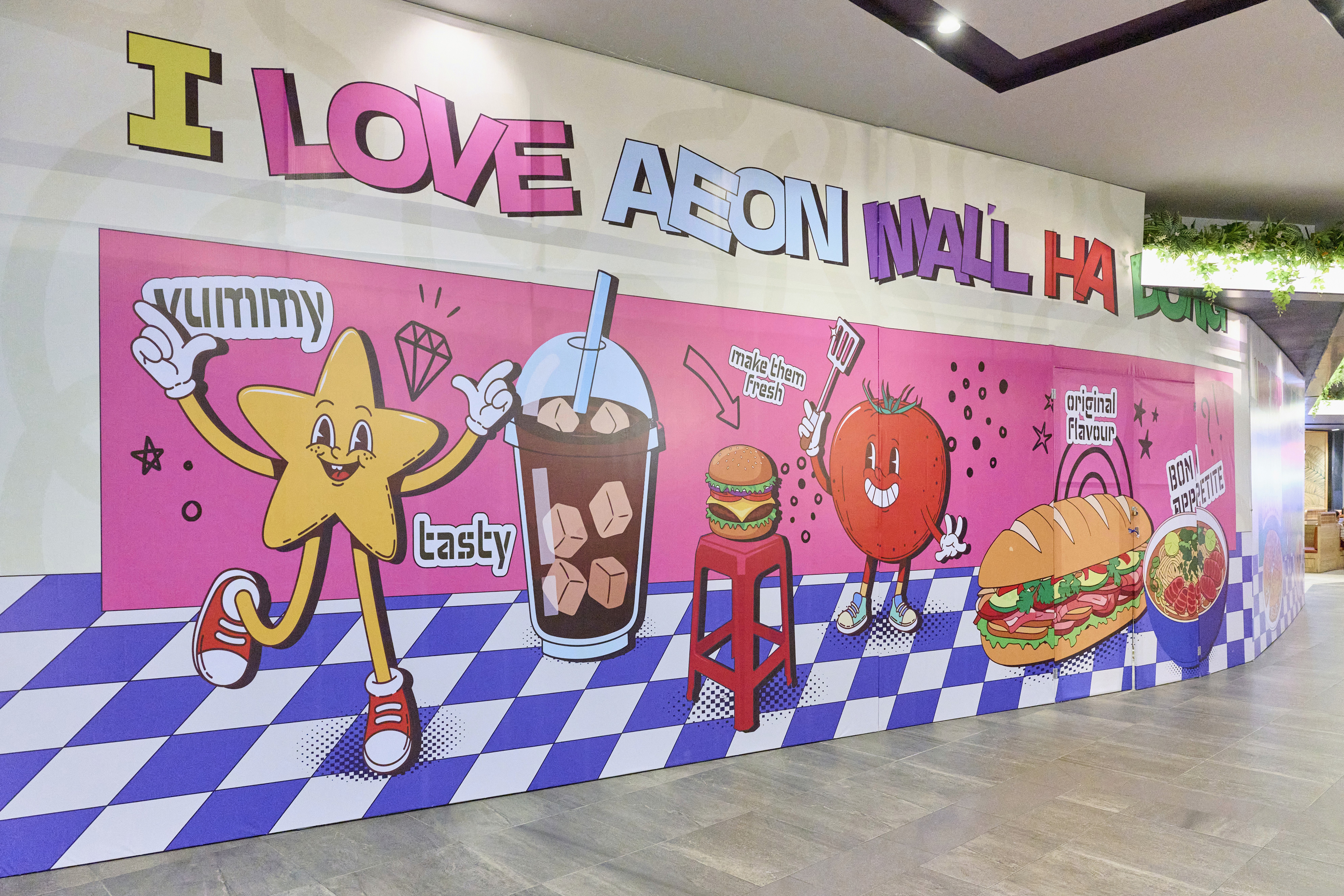
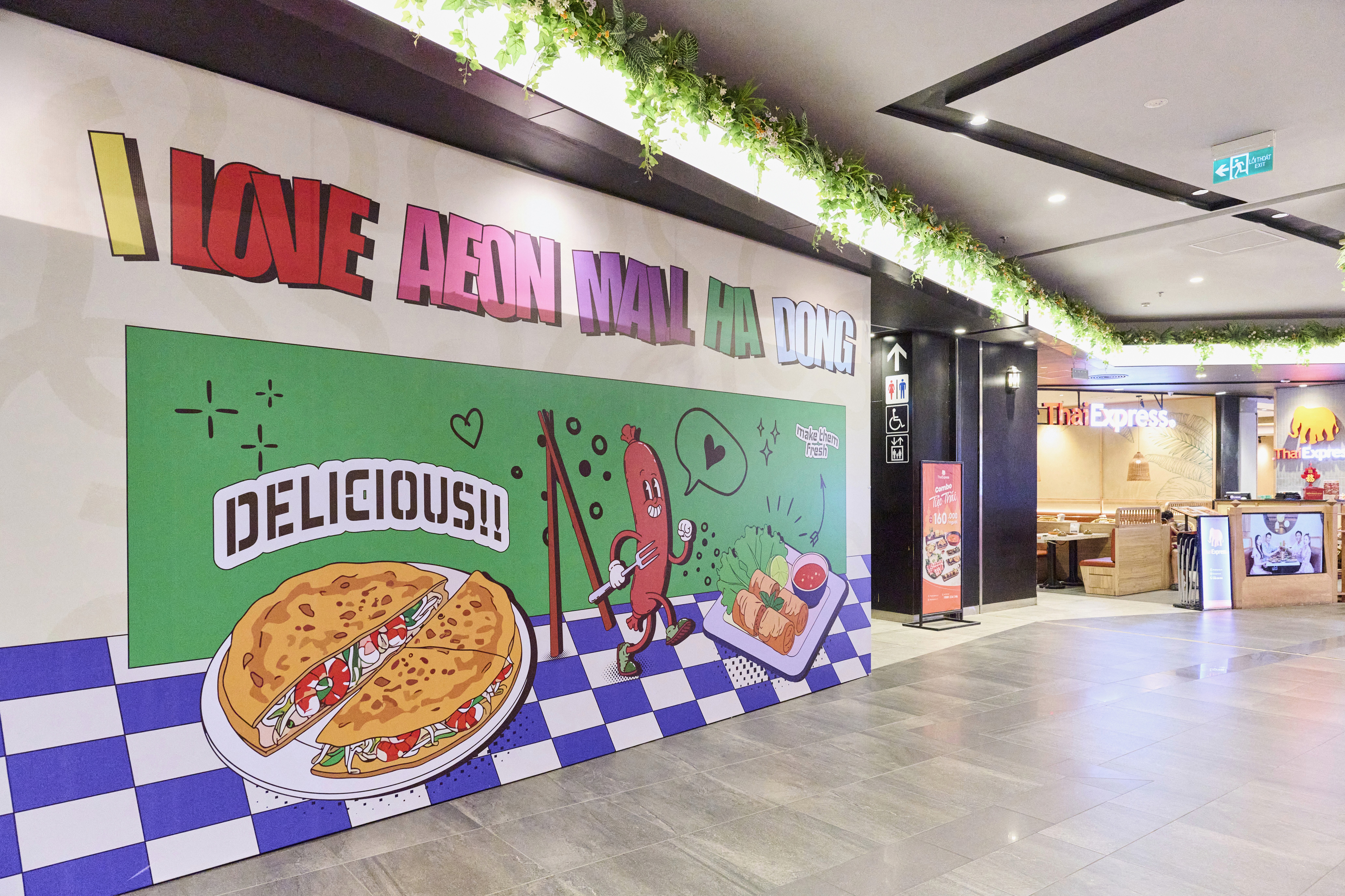
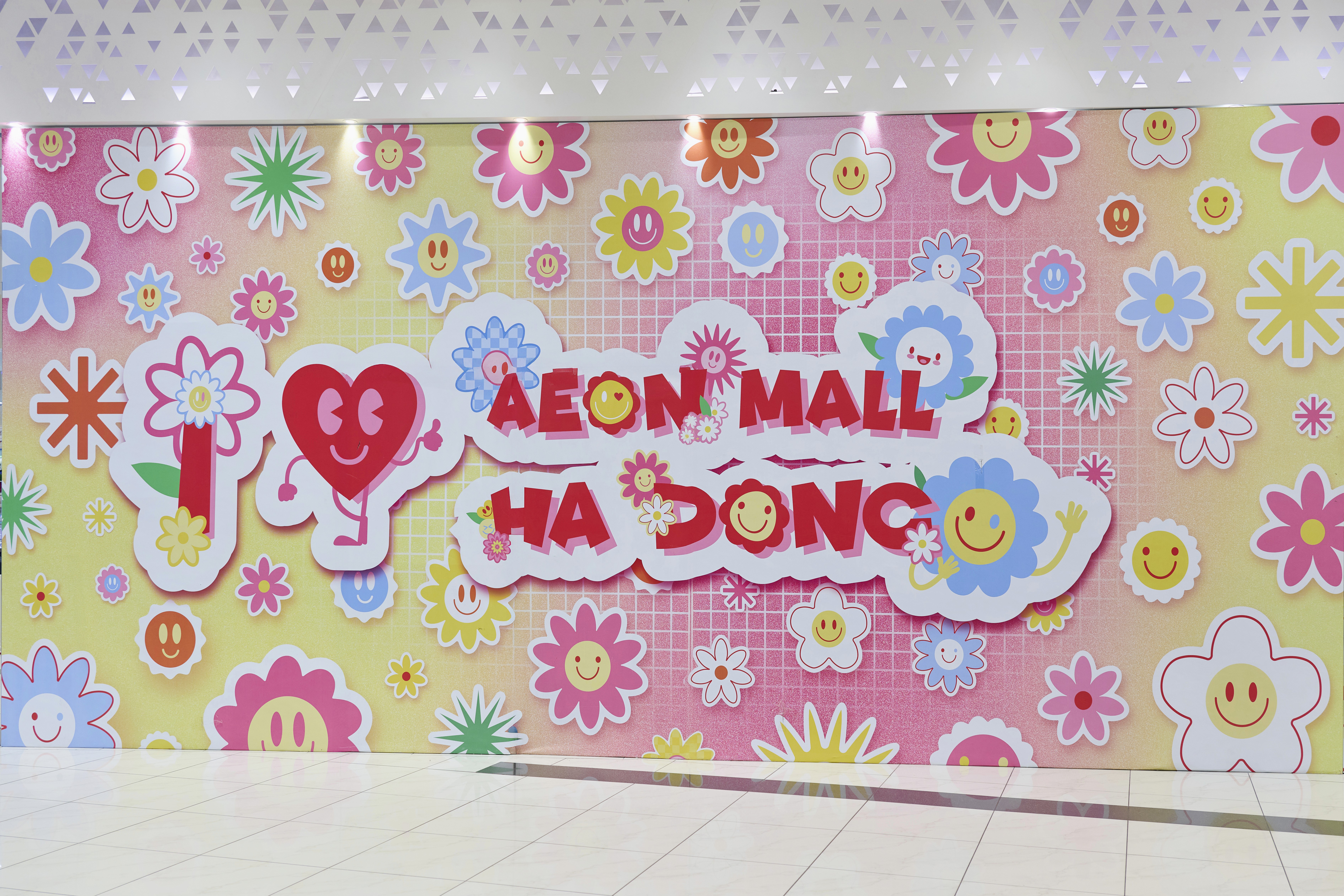
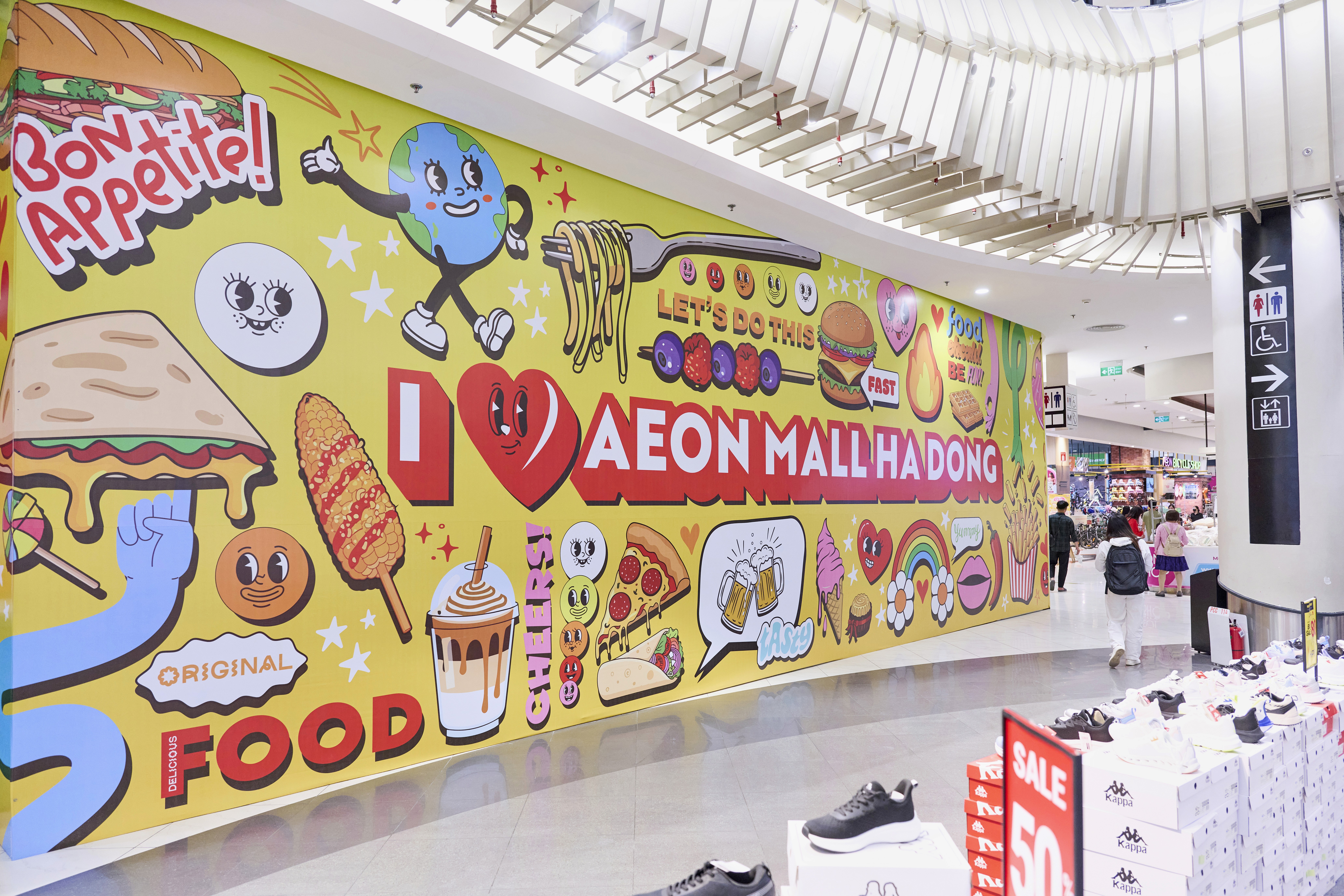
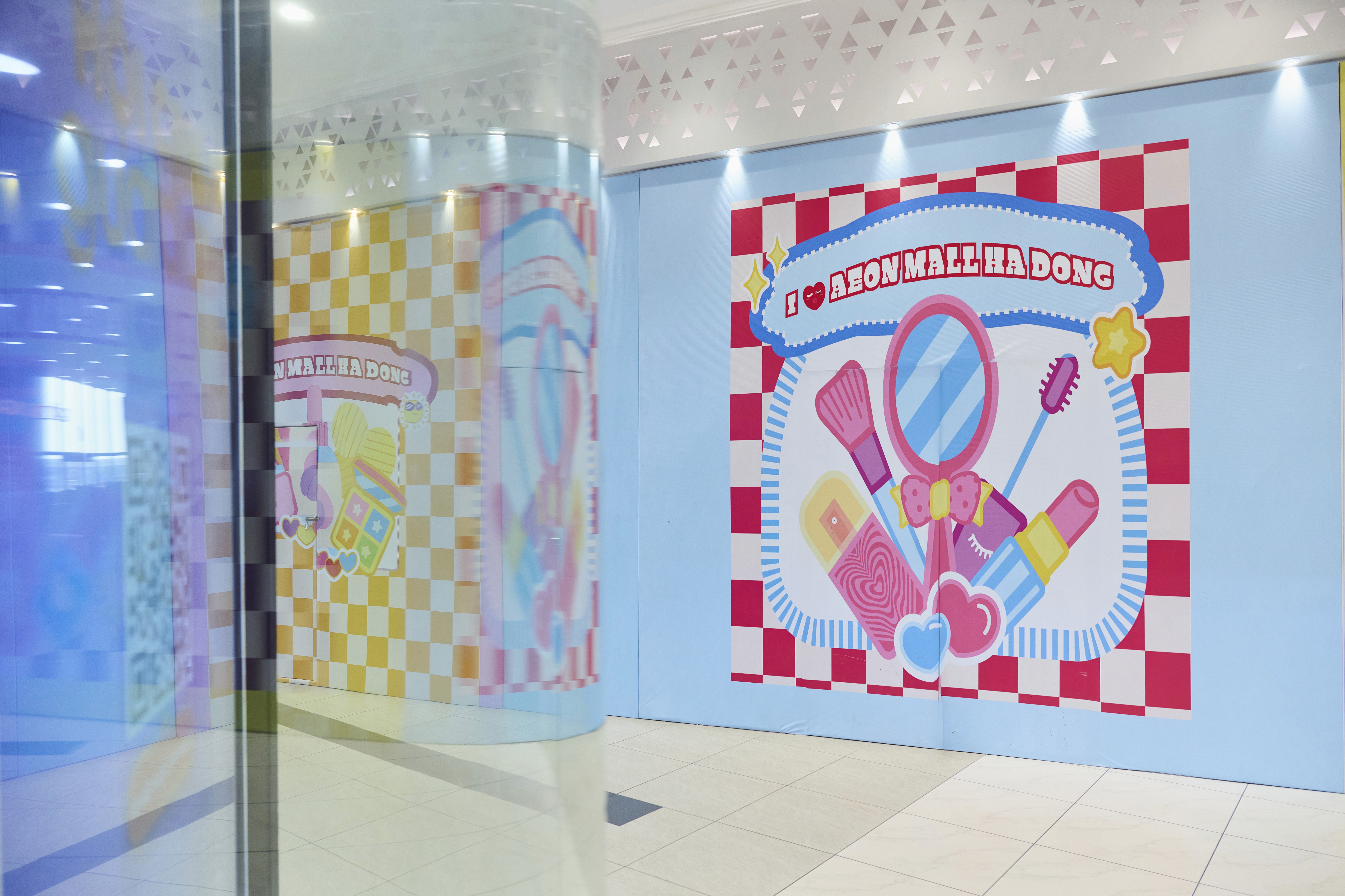
Rather than a single unified visual, Look built a multi-theme hoarding system that transformed AEON Mall Ha Dong into a street-level gallery. Each zone carried its own distinct personality: fashionista animal characters for "I Love AEON Mall", vivid cartoon pop art, and a retro gaming section in yellow and neon green. The strategy was designed to encourage movement, giving visitors multiple check-in destinations rather than one central focal point. Consistent principles ran across every zone: high-contrast colors, clean graphic elements, and symmetrical compositions that frame a perfect shot from any angle. Visuals were grouped by retail category. Fashion and lifestyle ran in pink-red tones. Pop culture used a broad neon palette. Food and beverage leaned into appetite-driven illustration. Each group had its own color system and style, unified by the same visual logic throughout.